This year’s Frieze New York (an art fair) was in May. It is now August. Nevertheless, considering I still have high-quality, publication-ready images plus the necessary credit information at hand, all of which was meant for press purposes the whole time, here I am, writing about Frieze (and a couple of other art events from around the same time).
I already wrote a bit about Frieze (and, again, other parts of New York City’s May crop of art fairs) on this website… but I have more that I wanted to say and essentially catalog for future reference.
Frieze New York… & Andrew Edlin Gallery
Probably my favorite booth across the entirety of Frieze New York — which is the fair where I felt the most like I was walking among people of… high economic status — was the selection of artwork from Andrew Edlin Gallery, whose physical location on Bowery in New York City I’ve never actually visited. I did also check out and seriously enjoy this year’s edition of the Outsider Art Fair also in New York, and Edlin is behind that, so.
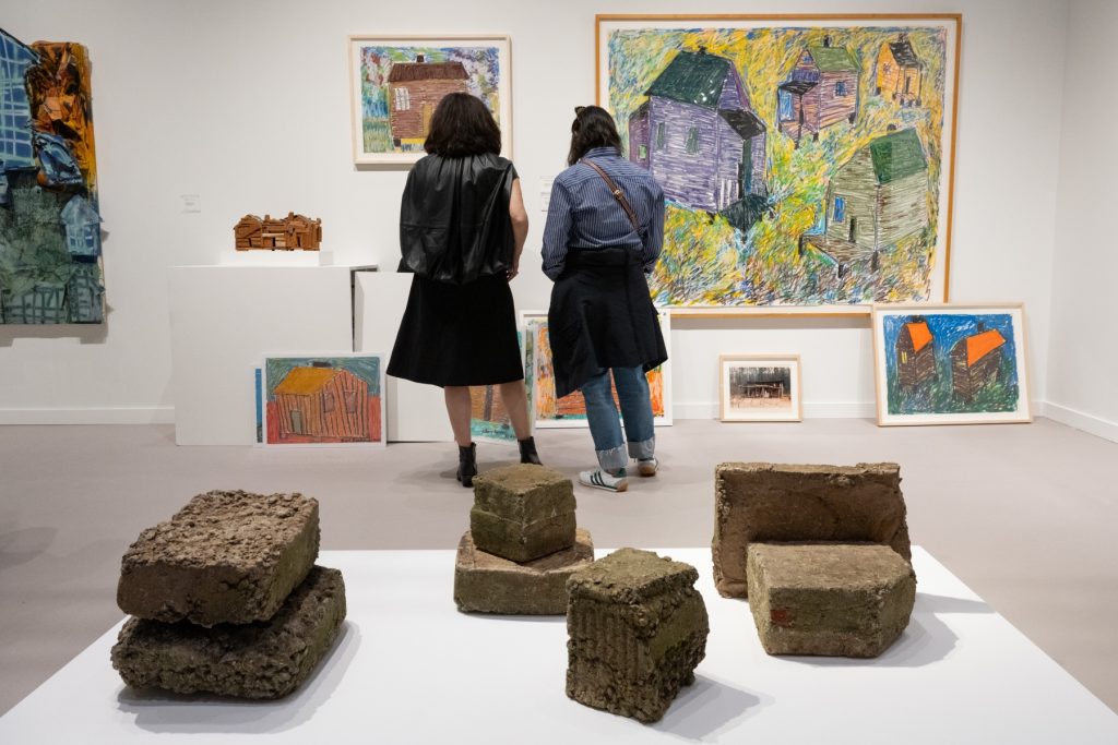
But as for the gallery’s Frieze presentation, it included artwork from Thornton Dial and Beverly Buchanan, both of whom are deceased.
The opportunity to see a selection of Dial’s wall-hanging assemblages was probably my favorite part of the entire fair. Besides the speculative intellectual context that I could — and would — apply and find interesting, I also just really like them. Dial’s work also showed up in the booth from David Lewis Gallery (which ended up closing up shop not long after Frieze). And I was fortunate enough to see even more of Dial’s output in a three-artist gallery show put on by Chapter NY over on Walker St about a week later. A streak of good luck!
Dial’s pieces consisted of various assortments of objects attached to wood and canvas. In very general terms, it’s like a portion of an upturned garage’s floor — with surprising aesthetic cohesion — lifted from its original space and made to hang on the wall. (The assemblages jutted outwards to a substantial extent from their base.)
The materials in one of Dial’s Edlin-shown artworks at Frieze were steel, metal banding, canvas, sticks, corrugated tin, wood, and enamel on wood. And as might be baked into expectations with this kind of endeavor already, Dial utilized found materials while working.
Buchanan’s works at Frieze included cast concrete sculptures. In terms of form and size, they were in the same realm as broken cinder block pieces you might see at a construction site or — again — put aside in a garage, but that wasn’t their origin. Buchanan cast the works, which the gallery arranged at Frieze on a broad pedestal rising only barely from the ground.
I found the genuinely fresh uniqueness of the concrete works ensnaring.
Viewed together, the concrete sculptures formed a weighty, sing-song atmosphere, drawing what felt like real personality from the imagined walls. Buchanan’s practice repeatedly focused on places of habitation and everyday usage that were more character and experience than aesthetic and structural perfection, and the snapshot I saw at Frieze pointed to a cyclical relationship between the people in such places… or any places, really… and their environment. In the same manner that the concrete physically bore marks of its making and history, it also carries the weight of its emotional role, whatever specific life experience it’s providing the structural bounds.
Gagosian
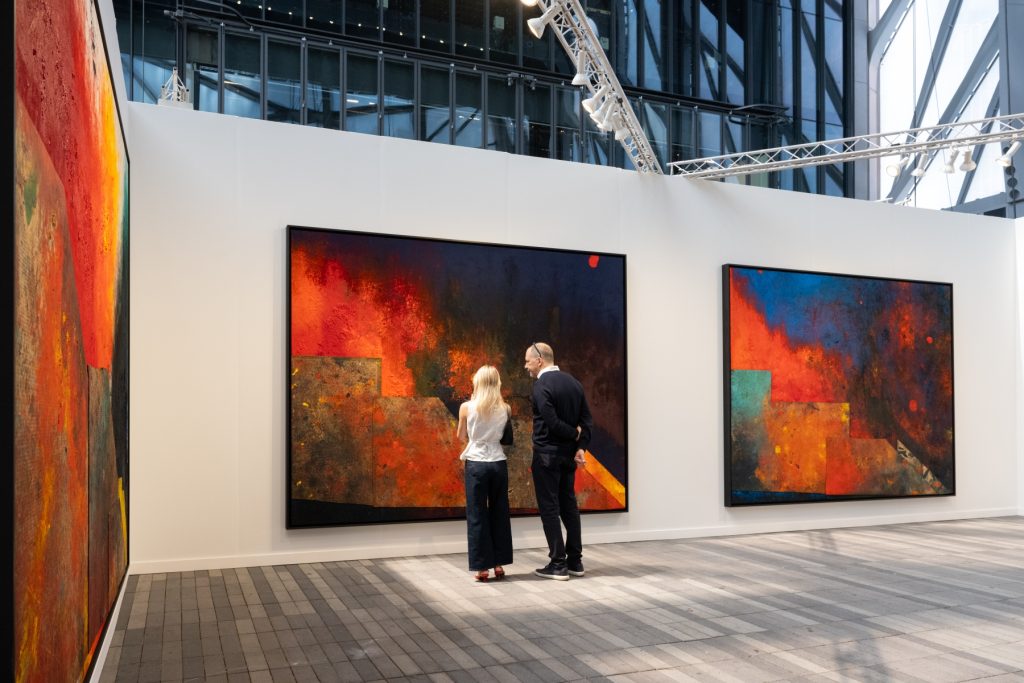
Gagosian brought out a series of artworks by Sterling Ruby, who’s based in Los Angeles. Though two sides to his practice were highlighted, what arguably stole the show were several massive, abstracted paintings in which, as the gallery’s press release explained it, process was important. (Laying canvas on Ruby’s studio floor is part of what preceded all of this.)
The paintings’ enthralling color palettes and texture stuck out to me — leaning into the essential qualities of the materials Ruby utilized. In short, Ruby used rich and somehow both dreamy but grounded hues to great effect. Dyeing and the application of actual oil paint were other stages to the massive works, and there was also cardboard collaged on the paintings’ surfaces.
A couple of the examples put cool and warm color tones in direct juxtaposition, which made the overall impact something enveloping — like a big sweater — rather than roasting or chilling. Much the same effect came from the free-flowing nature of the way that the captivating colors mixed across the commanding artworks, blending imprecisely and messily while filling what appeared to be the entire underlying surfaces.
I think the tone of Ruby’s artworks also hearkened towards grand forces that we might look towards as they remain nevertheless beyond us. Perhaps romantic, they at least seemed cosmic… which was a specific facet to Ruby’s other featured works.
Gladstone Gallery & Pace
I can combine these last two. After combing through images from Frieze, I settled on a selection of big, well-known art galleries… but I mean, that was a lot of what this particular fair had to offer. I’ll be back to the Lower East Side’s exhibitions in no time, come September.
Gladstone Gallery shared a selection of paintings by Alex Katz, whose somehow both bold and relaxed — and relaxing, honestly — style is always a pleasant sight.
This time, Katz was working with imagery of trees, outlining the presence of those cornerstones of the natural world with enveloping surroundings of reddish orange. And I can get onboard with Katz’s abstracting in the face of our perceptual expectations of a tree or forest. The paintings were very pictorially communicative but not at all photorealistic, instead establishing the scenery that Katz was crafting with big, broad areas of color combined with gestural brushstrokes where the trees’ bark would be, providing some visual grounding there.
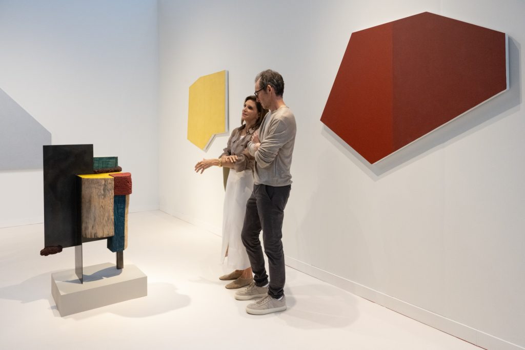
And Pace presented artwork from Robert Mangold and Arlene Shechet, though I connected most with Mangold’s work, despite not actually hearing of him before.
At Frieze, Pace shared a series of paintings from Mangold: surprisingly shaped, angular canvases bearing just one or a couple colors, those differing colors strictly delineated. The general idea I was thinking about was on par with what I enjoy about the late artist Ellsworth Kelly’s work: an appreciation and elevation of splashes of angle and color that together hearken to the many-faceted shaping across our lived environments. Mangold’s combinations of angle and color operated like characters in a movie in which you’re surprised to be a part.
Well, that’s Frieze New York 2024. I resent an investment-focused mindset around art, though I appreciate the opportunity for any hardworking artist to get their due. (And working with someone else’s financial concerns has long been part of art, all the way back to commissioned church art in Europe.)
Financial ballooning aside, attending Frieze New York this year provided me with a valuable opportunity to see a subset of recent stages of art history. Besides the more focused presentations I mentioned above, the fair also featured a lot of the other option: group presentations featuring just one or a handful of artworks from a given artist, alongside others. A sampling of lasting talent.
The rest of my look back is going to have to be in another post, because I think we’ve maxed out this one’s reasonable length.
Featured image: credits listed above
You may also like
-
Diana Kurz at Lincoln Glenn in New York: A Review of a Shining Art Exhibition
-
Dustin Hodges at 15 Orient in New York City: An Ensnaring Exhibition at an Exciting Gallery
-
Maren Hassinger at Susan Inglett Gallery in New York: Reviewing an Uplifting Art Exhibition
-
Enzo Shalom at Bortolami in New York City: Reviewing an Entrancing Exhibition of Paintings
-
“Ben Werther: Townworld” at Amanita in New York City: Reviewing a Richly Memorable Art Exhibition