Two floors up on Grand Street in the area of New York City’s Chinatown, I recently visited the art gallery Derosia’s “Practice Quotidian Ecstasy,” a show of often enrapturing paintings by the late artist Gene Beery, to whom I was first introduced (as best I can recall) in this context. Beery, originally from Wisconsin, passed away only last year after decades of artistic activity.
I’d visited this gallery previously, mentally clocking the institution as one of refined experimentation. I feel like even its physical location cultivated this feeling for me, as it’s not quite in the center of the art gallery districts in New York City with which I’m personally most familiar but was presenting obviously impactful works from a perch with a nice view, if you look out the window. I think the actual, physical experience of getting to a given exhibition is an important part of the whole thing, though sometimes a subtle contributor.
Moving through the Exhibition
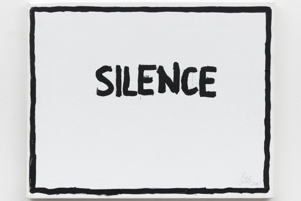
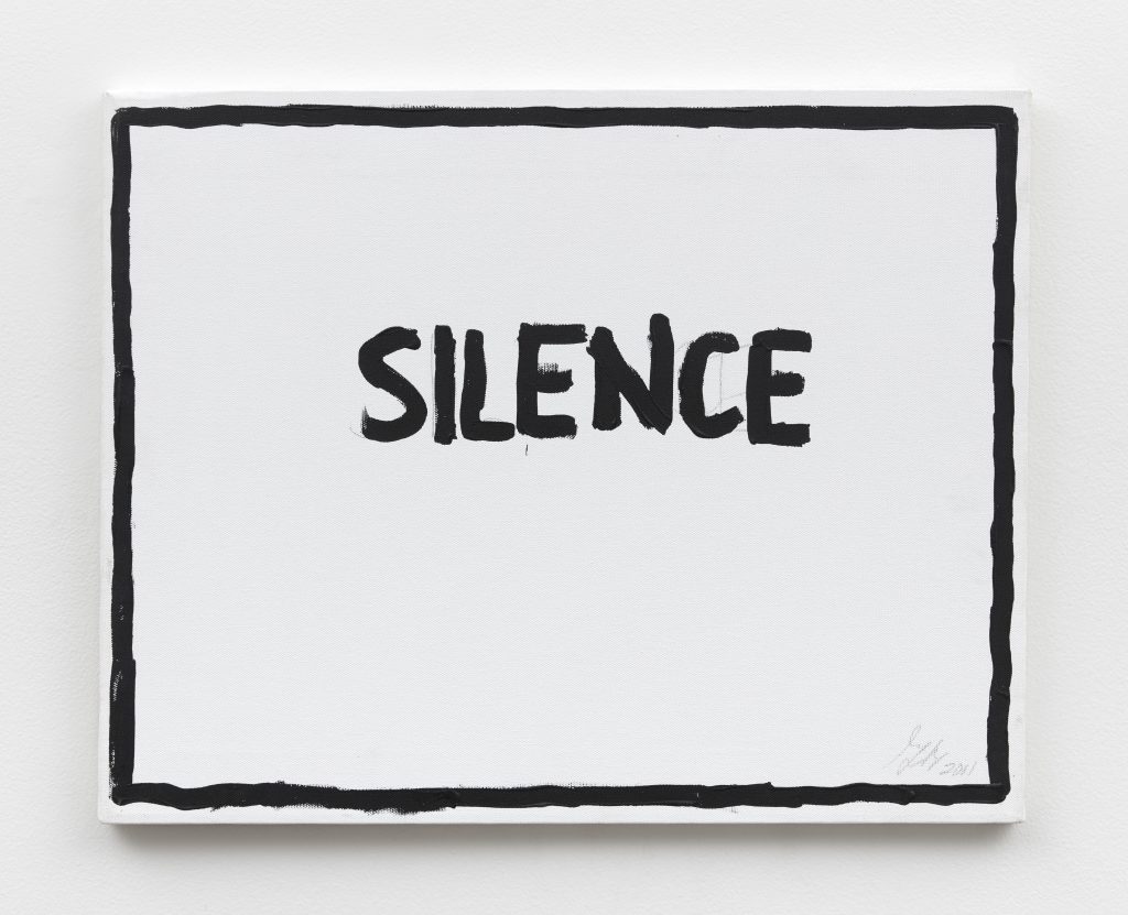
Arriving, I started in the back with “Silence,” a 2011 piece consisting of acrylic and graphite on canvas. Visually, it’s direct, centering the word “silence” written roughly around the center amid a black, picture frame-like border.
I was thinking a lot that day about the rhythms created by the combinations across various elements to a given artwork, breaking it down into layers. Put more directly, what’s the overall impression — driven by whatever comes up or leads the way — left by the piece’s combination of materials/textures, whether inherent to the components or created via the artist’s choice for how it’s all put together? How about the spatial rhythm of whatever forms appear, meaning how the shapes fit together? And of course, don’t forget the color palettes.
There’s also the factor of how the piece that’s being considered relates to its parallel in what you might term “real life” or everyday experience, assuming there is such a parallel.
And looking back, that conceptual level of these pieces sticks out prominently to me. Painting the word “silence” in resolute black with plenty of visible canvas texture across the piece contrasts, I think, with most experiences of the concept, as silence would be understood as an absence of sound, something difficult to grasp in tangible terms. We know it when we experience it, but we don’t normally see “silence.” So it’s jarring — not incomprehensible, but out of the ordinary.
The combination of obvious handiwork and firmness in the piece’s textures (acrylic paint helps with this) alongside the reasonably stable visual rhythm of the piece — and the steady assertiveness of black and white — buttress this. It’s forceful, and it’s pleasant. “Silence” is given an open-ended — but decidedly uplifting — physical form.
Finding the Light
Honestly, a lot of Beery’s pieces on display through most of April at Derosia felt uplifting, and not just because of the sometimes centered humor.
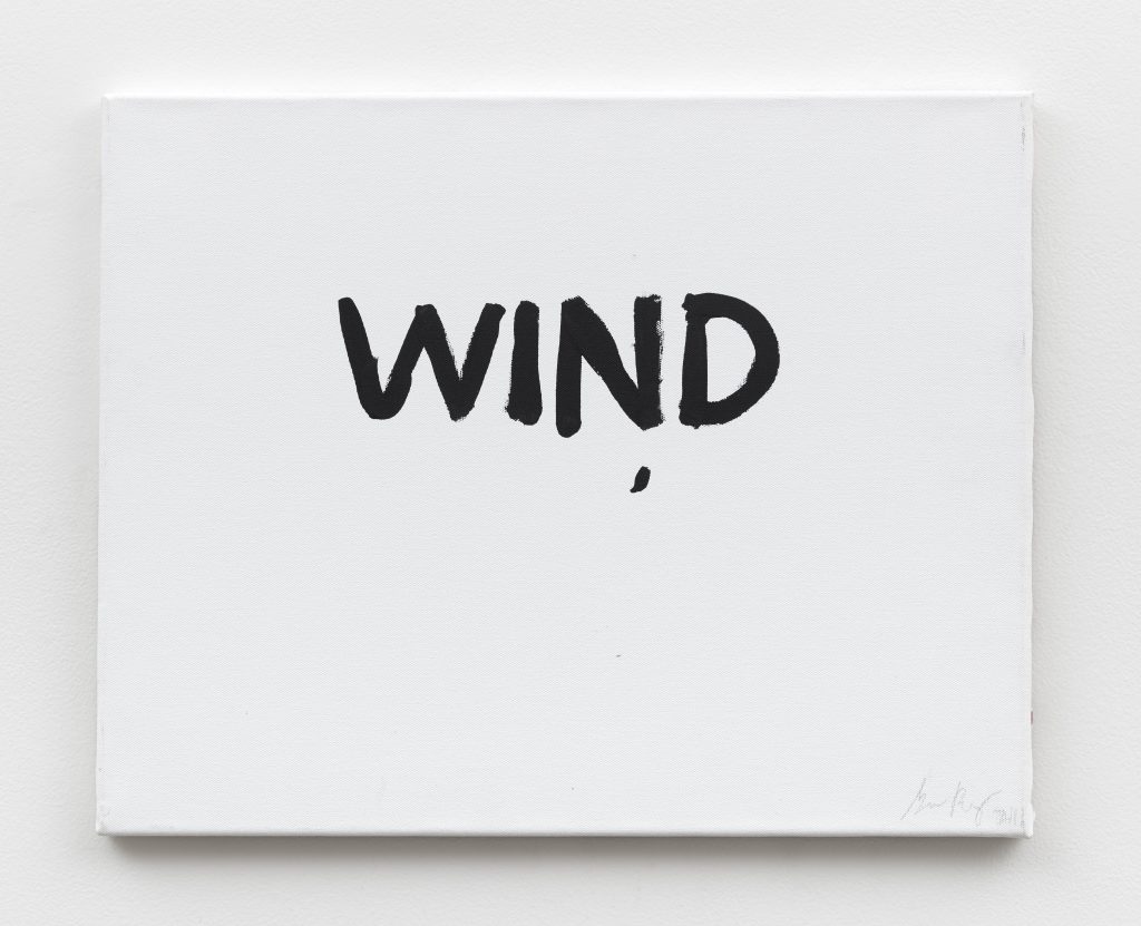
Visually quite similar to “Silence” is “Wind” from the same year and comprised of the same materials, making the whole experience of rejuvenating, blunt force a little more shifting and alluringly fleeting. If you’re effectively compelled to consider the visual properties of the English word “wind,” it’s shorter and gets on its way faster, flowing off into the imagined distance.
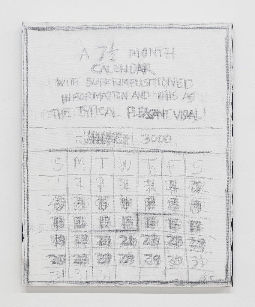
Another standout was 2005’s “A 7½ Month Calendar,” which is comprised of the same materials as the aforementioned duo but centers the graphite more. The process of constructing the work appeared to consist of Beery writing, in graphite, seven and a half months worth of day-demarcating numbers across a single calendrical grid. It’s essentially seven and a half (apparently) calendar pages presented all atop each other.
There’s more intricacy to the rhythms here considering the detail spread across this month-long grid, but it’s still visually firm, capturing something I think essential to the nature of time as it progresses. That’s the somehow supportive instability of how it moves forward. You can get lost in it, but there’s still the opportunity to shape — in the real-world version of all of this — an entire life, really. Some portions of the piece are largely unintelligible because of the evident layering of numbers, but it’s all still assertive and stable. It clearly works.
You want to engage with these simultaneously ambitious and down-to-earth pieces when you’re standing there.
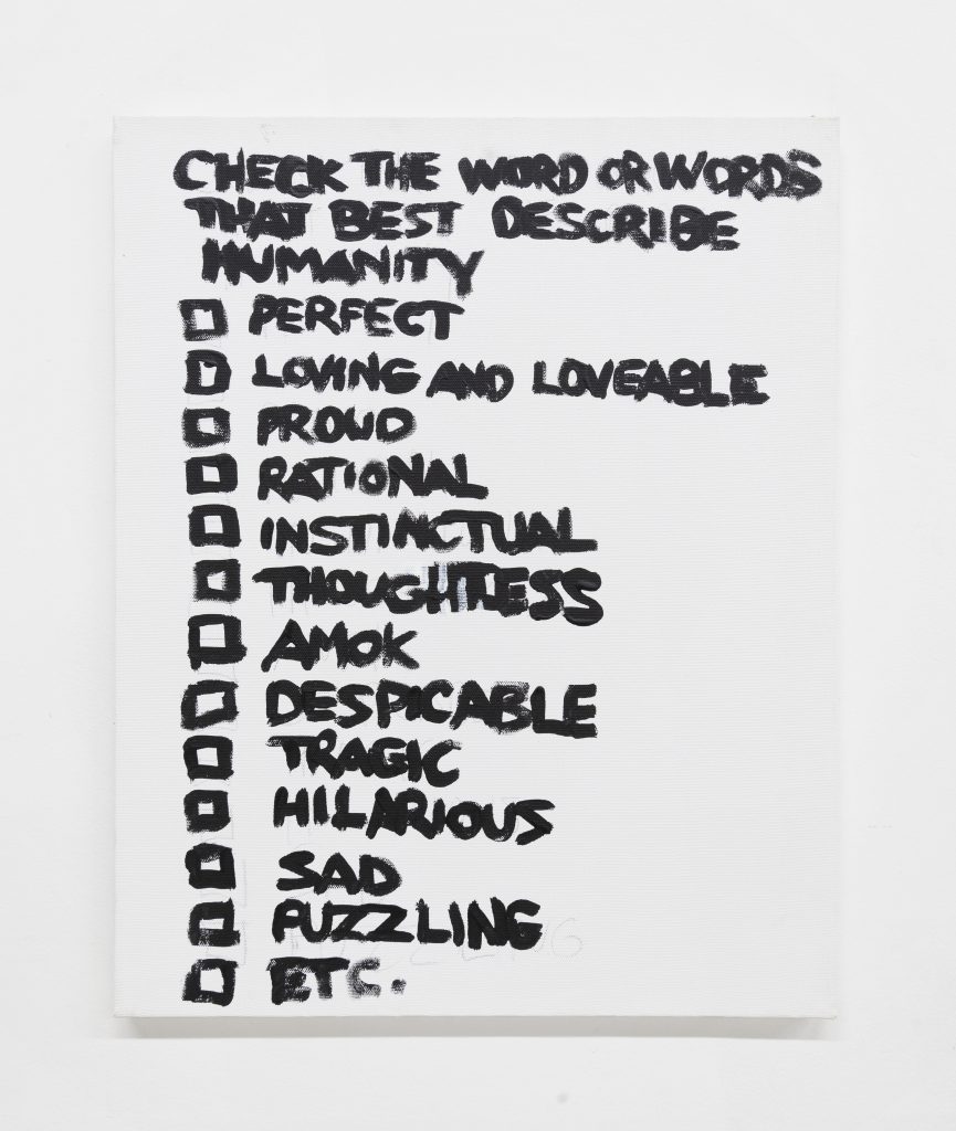
“Check the Word or Words That Best Describe Humanity,” a 2012 Beery piece, again uses acrylic and graphite for a color palette of black (and gray) and white (from the canvas). It’s pretty much exactly as that title describes, presenting a list of words with empty check boxes alongside each one. The list is comprised of attributes — some positive and others destructive. (“Rational” and “thoughtless” both show up.) Like other examples from Beery’s career on display, this piece blends perhaps familiar tumult into an invigorating, earnest assertiveness. It’s bombastic but tuned to a level perfect for these purposes.
The energy is high and enlivening, and everything moves in impressively orchestrated unison.
“Practice Quotidian Ecstasy” is on view through April 27 at Derosia.
You may also like
-
Diana Kurz at Lincoln Glenn in New York: A Review of a Shining Art Exhibition
-
Dustin Hodges at 15 Orient in New York City: An Ensnaring Exhibition at an Exciting Gallery
-
Maren Hassinger at Susan Inglett Gallery in New York: Reviewing an Uplifting Art Exhibition
-
Enzo Shalom at Bortolami in New York City: Reviewing an Entrancing Exhibition of Paintings
-
“Ben Werther: Townworld” at Amanita in New York City: Reviewing a Richly Memorable Art Exhibition
