Future Fair, taking place this year at New York City’s Chelsea Industrial (the name of a venue in the city’s Chelsea neighborhood) through May 4, was colorful: very, very colorful. I’ve got no idea if there was some kind of premeditated purposing to the through-lines that were on display across the gallery exhibits, but whether intentional or not, the collective impact from the dozens of booths snaking through the event ended up mostly bright and uplifting.
It was very different from some of the other art events I’ve been attending this week, which — like Frieze at The Shed, a venue just a short walk from Future Fair’s spot — presented interesting work in environs that felt oddly sterile sometimes. At Future Fair, whether up close, standing back, or walking briskly through the entire event, the feel was pretty much the same: color, vibrancy, exploration, and the like.
Yi Gallery
I ended up on my first visit to Future Fair starting with the Yi Gallery booth, showcasing a selection of impactful artworks from the New York City institution.
Personally, I was most taken in by pieces from artist Margrethe Aanestad, including a piece more than seven and a half feet tall and comprised of dark blue pastel chalk on paper. “Silent Transition VII” (2023) felt both quiet and monumental, presenting a single, large rectangular shape on its end in the middle of the surface, with three of the sides sharp and crisp and the last — the bottom — shaped instead like a ripped piece of paper.
It was a bit like an obelisk to a forgotten deity, turning from the target-focused factor to those kinds of religious excursions to, well, the other parts. Aanestad centered a sense of reach, ambition, and growth, a combination of the urgency of street posters and the measured focus of functional, commercially focused architecture — abstracting, one could imagine, a church steeple or clock tower. It’s easy to connect the blocky, rectangular form to a cityscape. While arguably minimal in nature, through strands of the work including its sheer size this piece really bursts with energy.
That piece is viewable here.
Susanna Gold
Another standout from opening night was another series of large rectangles on their end: paintings presented by exhibitor Susanna Gold from artist John Dowell, who has been active for decades.
The three works from the late ’70s and ’80s, all about seven feet tall, were comprised mostly of white acrylic paint on canvas — but making these pieces different from, say, Robert Ryman, the physical process of Dowell applying this paint to the canvas remained extremely evident.
There was texture throughout the surfaces clearly pointing to the original distributions of the paint, and the expanses of white were interrupted by brief but remarkably energized bursts of other color presented in spectrums rather than monochrome.
Gold connected these paintings to interests shared between Dowell and other artists in the opportunities of time and space like captured elsewhere through dance. They moved with that kind of focus, nearly lifting themselves from their surfaces. Artfully deployed scope was another important element here, as the expansive forms of the canvases themselves made the living cloud-like energy spread further.
See some from Gold here.
Abigail Ogilvy Gallery
I was rather transfixed by sculptural pieces showcased by Abigail Ogilvy Gallery from artist Cathy Della Lucia.
One example, “Privacy Gate with Invisible Crutch,” featured the following range of materials, which is a good starting point to wrapping your head around it: wood, plywood, bamboo, glazed ceramic, paint, dye, stainless steel grab bar, turf, plexiglass, acrylic rod, hardware, and varnish.
The overall form of the thing really did resemble a gate, at least in retrospect, combining a series of smaller forms into that top-level visual impact. I was thinking about some of the previous sculptural work I’ve seen that, in a twisting series of forms comprised of variously textured materials (the variety is important), hearkened to the human body, but that’s not quite where these ended up, though there was an association.
Instead, it was more like jovial architecture, with those smaller forms coming across as artfully jumbled — curving, leaping, soaring, and otherwise suggesting free-flowing energy combined with the physically jarring nature of some of these materials or just their frequent usages. But from this artist, the combinations felt more sing-song than imposing. A couple of these incorporated a stainless steel fishing rod mount, making the contrast that the artist elevated into a dance of opposites clearer.
See the Ogilvy presentation here.
Suppan
Another highlight was the Suppan booth featuring artist Michael Ornauer. The artist and gallery both hail from Austria.
Ornauer’s works on display were largely small and featured materials that ranged from oil on canvas to acrylics on jute. All were abstract, featuring rich varieties of color and extensive layering, and the inviting artworks were arranged in constellations snaking across the walls of the booth rather than in neat rows.
The selection of paintings found richness in quick moments of color and de facto form; they didn’t suggest form in the traditional sense, with any feeling of shape on the surfaces more of a byproduct of painterly processes hinging on color and, in instances where Ornauer intermingled the layers in some fashion, procedure.
I felt by the end of the booth that what Ornauer was capturing could be described as a single moment, a unique juncture in time — again and again across the works. Whether pockmarked, scraped, or draping via that ambitious, texture-adding layering, the paintings added color and emotional depth to things that can be so transient.
Considered in this context, it’s like Ornauer visualized the process of time itself slipping away. The artfully fleeting scope of the visual rhythms is insistent, but you still find elements to appreciate. Ranging in specific tone, Ornauer’s color palettes are all rich.
See Suppan and Ornauer here.
Geary
In one of the first booths I would encounter via the Future Fair entrance that I’ve used were artworks by Alan Prazniak from Geary, a gallery based in Millerton, New York.
Utilizing, among other materials, oil on linen, Prazniak presented arrays of shapes lying against each other with color palettes that suggested physical heft. Striking an artful balance, the visual assemblages felt smooth but subtly disassembling, like a snapshot of an isolated residence that’s slowly falling apart but still loved or a shorefront scene in which there’s a mound of decaying, old plant life.
Those are very specific analogues, but in general, the visuals seemed to balance care with an artful — even if physically limited because of the materials’ scope — incorporation of some of the unwieldy forces that flow through much of the natural world and even our own species’ effective imitations of that in our cities and, generally, architecture.
A lot of Prazniak’s forms were small enough to require a significant number to actually approach the edges of the surface, which amplified the sense of caring construction that seemed balanced with exploring how some things might just always look slightly askew by nature.
The structuring of Prazniak’s images — arranged in perceptible patterns even if the forms themselves seemed almost ready to fade or fall, moving beyond simply order — suggested that it’s going to be fine — great, even!
See more from Geary here.
A lot of these artworks are viewable on Future Fair’s digital companion, which will run through (almost) the end of May.
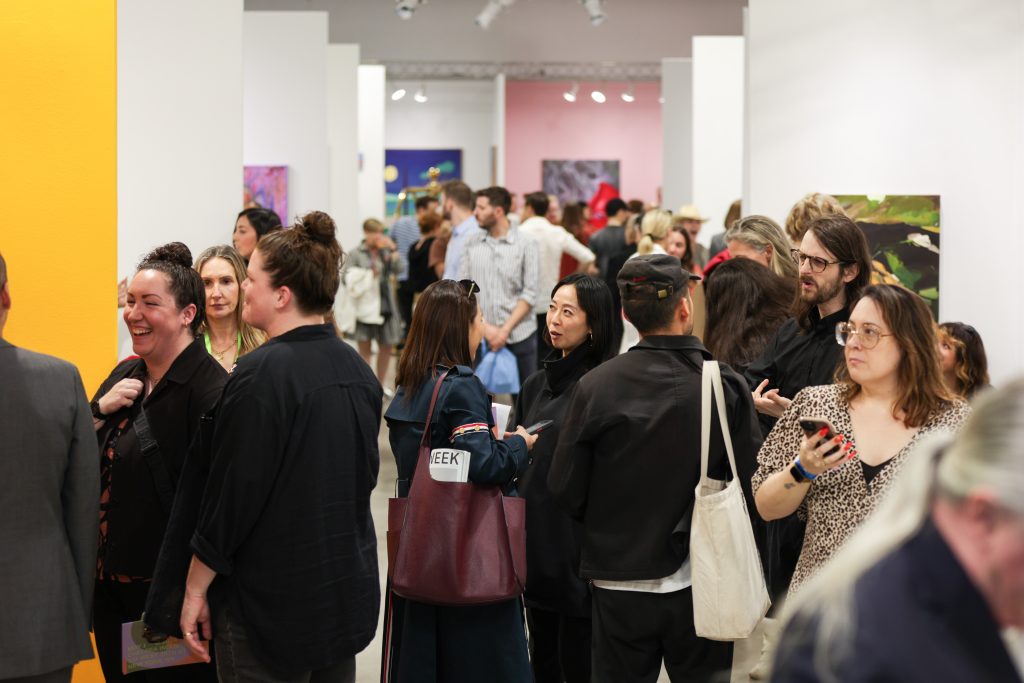
Featured image: Future Fair 2024 VIP Preview; Photo by Keenon Perry
You may also like
-
Diana Kurz at Lincoln Glenn in New York: A Review of a Shining Art Exhibition
-
Dustin Hodges at 15 Orient in New York City: An Ensnaring Exhibition at an Exciting Gallery
-
Maren Hassinger at Susan Inglett Gallery in New York: Reviewing an Uplifting Art Exhibition
-
Enzo Shalom at Bortolami in New York City: Reviewing an Entrancing Exhibition of Paintings
-
“Ben Werther: Townworld” at Amanita in New York City: Reviewing a Richly Memorable Art Exhibition